
Roku has launched the first significant update of its home screen in over a decade. It introduces a more dynamic presentation guided by user behaviour. Apparently, no two viewers will see the same home screen. The new design is available on all Roku televisions and devices in the United States and will roll out elsewhere in the coming months.
“When we set out to rethink the Home Screen, we knew we should listen to the people who use it every day. So, we talked to the viewers, we tested extensively, and we pushed until the design and the data lined up for a meaningful update,” said Anthony Wood, the founder and chief executive of Roku. “Now, our new Home Screen puts entertainment at the centre of everything, while staying true to Roku’s simple, intuitive roots.”
With billions of possible home screen combinations, intelligence models pick the best one for each viewer every time they turn on their television.
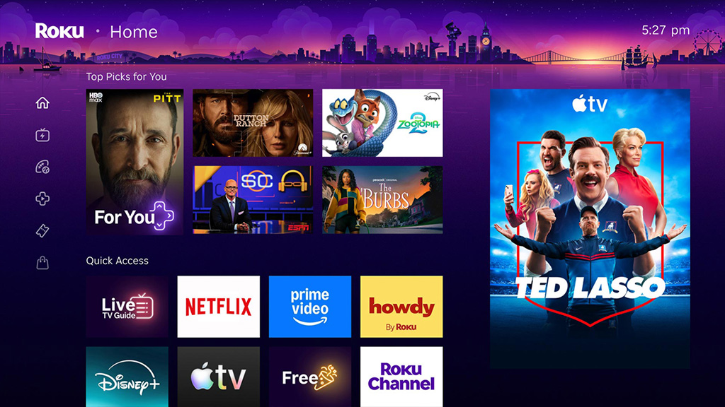
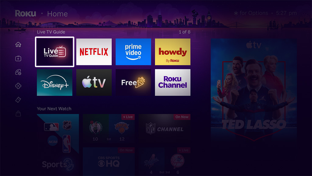
New features include Quick Access to frequently used apps, adapting to usage routines.
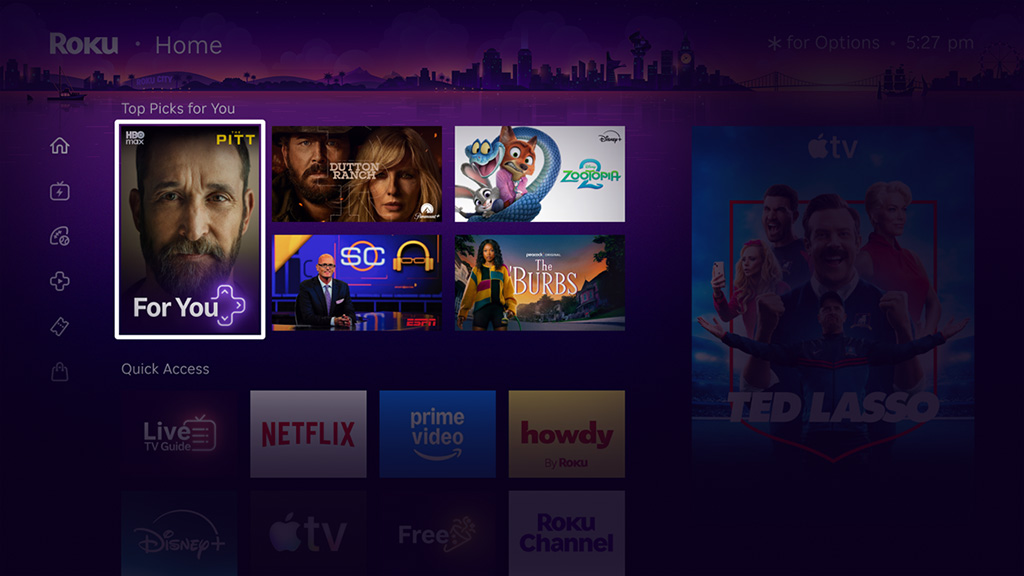
There is a smart “Top Picks for You” section, with personalised relevant recommendations based on user interests and what is trending on Roku.
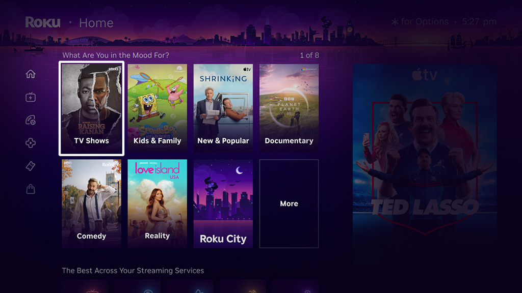
Destinations provide curate hubs based on genres and moods.
Subscriptions provides a convenient way to browse and discover programming from across multiple subscriptions.
The home screen menu now collapses to the left, as with many other online video interfaces. Roku says that leaves less clutter and more space, providing a cleaner canvas for discovery. There is also more room for prominent promotions.
Live television is just one tile in the interface, which is increasingly concerned with aggregating online video viewing options. It will be interesting to see how that integrates with Freely on Roku televisions.