
The BBC is revamping the presentation of its iPlayer on television screens, as part of an attempt to “modernise the user experience”. The move to a left-hand navigation menu with icons looks more like a web site or app from Netflix or Amazon than a televisual experience. Any resemblance is no doubt entirely coincidental.
“The navigation menu will move to the left-hand side of the screen — making it easier to browse different categories like comedy, drama or sport,” writes Neil Hall, the head of product for the BBC iPlayer. “The change also gives much more space on the screen for our content, so viewers are more likely to spot something new to watch.”
“This is the first of a number of iterative updates from us as we strive to create a better user experience for audiences on web, mobile and TV across BBC iPlayer, and we’ll have plenty more to come in the months ahead,” he added.
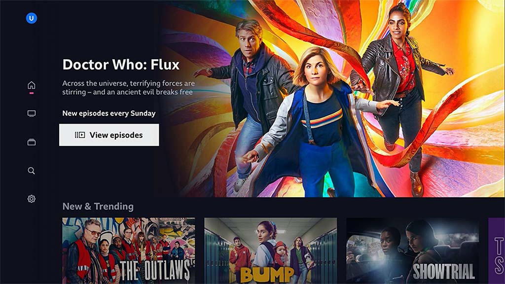
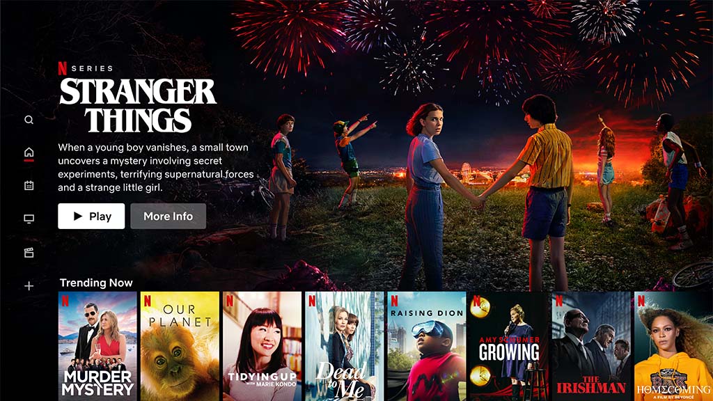
There is a remarkable similarity to the design of the Netflix user interface, including the position and size of the icons and the alignment of text and imagery.
There are changes planned for the web and mobile versions of the BBC iPlayer, so the experience feels more consistent, with similar enhancements for other digital services like BBC News, BBC Sport and BBC Sounds.
It seems that the BBC is trying to catch up with Netflix in its user experience, rather than setting its own design standards.
The BBC says that the new menu has been usability tested with adults, children and people with accessibility needs.
The revamp comes after the BBC rebranded its logo, using a custom font with letters that are slightly smaller and gaps between the blocks that are slightly wider. There is also a new logo for the iPlayer.
It seems that it is part of a long-term strategy, first revealed in the BBC mocumentary W1A, to make the BBC look more like an app. In this case, more like Netflix.