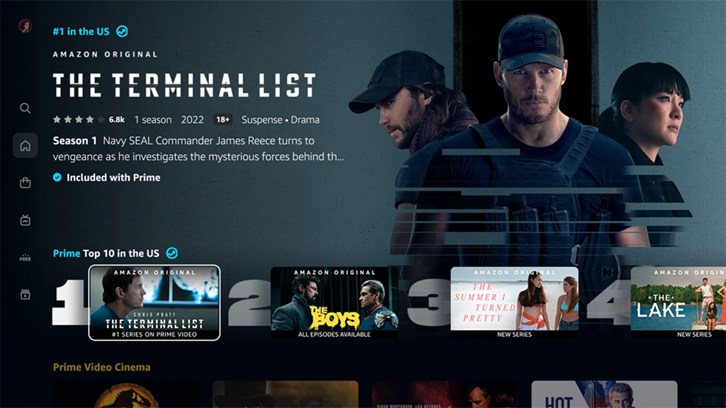
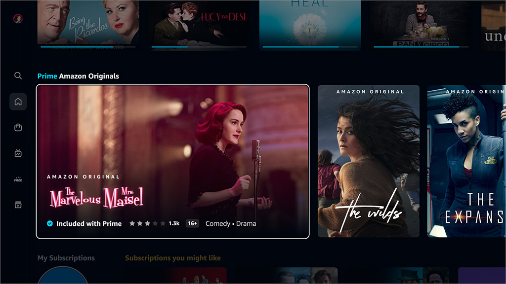
A long overdue redesign of Amazon Prime Video makes it seem unsurprisingly similar to Netflix. The new look is being rolled out worldwide within the Prime Video app on connected living room devices, including Fire TV, as well as on the Android app, with iOS and the web to follow. With online video services looking so familiar in navigation, finding something to watch is still a challenge.
The new design includes a simplified main navigation menu. For living room apps this has been relocated to the left side of the screen. The app will launch with six primary pages: Home, Store, Find, Live TV, Free with Ads, and My Stuff.

There is a programme guide for live and programmed sports, showing what is currently on air and when forthcoming programmes will begin.

There are new carousels with richer imagery, including a “Top 10 Chart”.
New design features make it clearer to see what is included within the Prime membership and what is available for purchase, marked with a shopping bag icon.
The redesigned Find page simplifies search, with options to explore by genre or collection.
The familiarity in design between different services like Netflix and Amazon helps users switching between them. It might suggest an evolution towards an optimum user experience. The frustration that many users seem to experience in scrolling through endless carousels on online video services might suggest otherwise.
