The BBC is finally offering regional versions of BBC One in High Definition in England, 11 years after it launched BBC One HD in November 2010. It means that viewers in England will no longer have to endure an irritating caption inviting them to turn over to standard definition for their regional news. The regional news in England is now available in high definition online and the BBC aims to offer it on all platforms by the end of 2022. Meanwhile, the BBC is rebranding its services, which will apparently make them easier to navigate, including new logos for its iPlayer and BBC Sounds apps, which show the corporation is beyond parody.
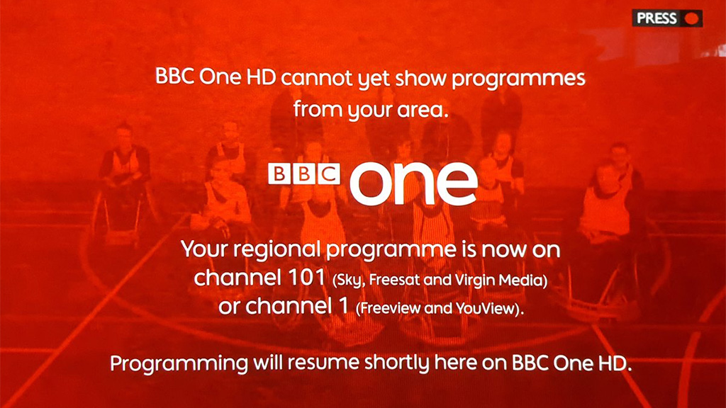
The BBC broadcasts versions of BBC One HD in England, Scotland, Wales, and Northern Ireland. Until now, that has meant that several times a day, viewers in England have been presented with a moving graphic suggesting that they switch over to standard definition to watch the regional news.

For some reason, BBC management considered that this was better than offering sustaining programmes in high definition. At last, they seem to have seen sense. Regional versions of BBC One are now provided in high definition, but it could be another year before they are available on all platforms.
Kieran Clifton, the director of BBC distribution and busines development, writes that “Significant infrastructure changes are required to make this happen — meaning some platforms will take longer than others and a phased approached to the rollout.”
Among the first to benefit will be customers of Sky Glass, whose numbers will be minimal as the online service has only just launched.
BBC iPlayer will reportedly switch from standard definition to high definition for the regional versions of BBC One in England “in the following months”. The BBC says that it will continue its rollout to other platforms over the next year, with the aim of being on all platforms by the end of 2022. That will be 12 years after the launch of BBC One HD and 16 years after the start of BBC HD.
It means that BBC One HD can finally become the default service for the main BBC channel and assume the top slot in electronic programme guides.
On the same day, the BBC announced that it has been busy creating a new version of its logo. The famous BBC blocks are a little more widely spaced and the lettering is a little smaller, with the typeface changing from Gill Sans to a custom font known as Reith, after the founder of the corporation.

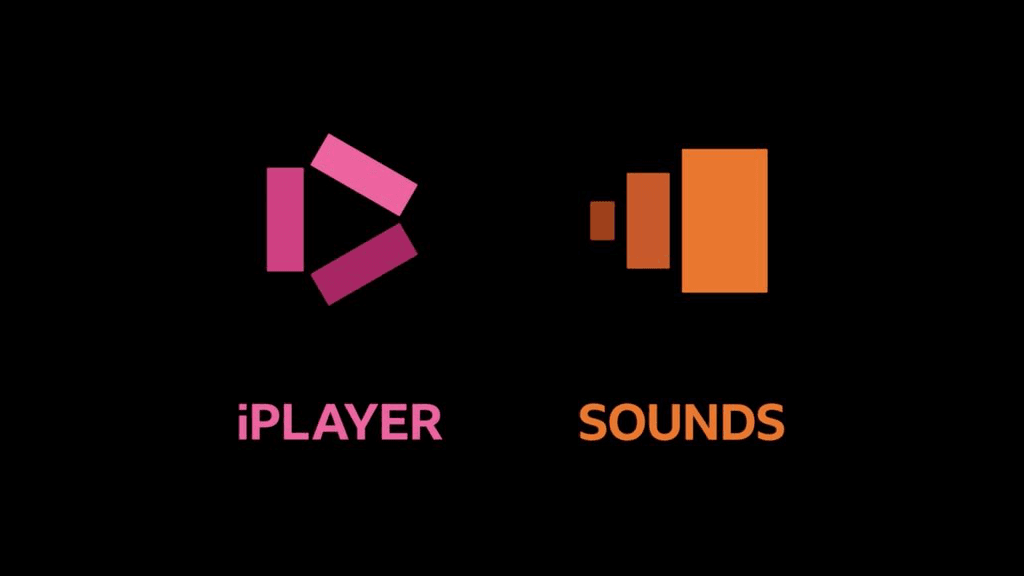
The brand-new identity has been rolled out across BBC One and other channels and there will be new logos for the BBC iPlayer and BBC Sounds.

Kerris Bright, the chief customer offer of the BBC, who was previously chief marketing officer at Virgin Media and has a PhD in Molecular Neuroscience, writes that “Our research tells us that audiences think some of our services look old fashioned and out of date. They want a modern BBC that is easier to use and navigate to find the content they love and enjoy.”
News, Sport, and Weather will also have their own symbols, made up of three blocks placed at different angles. “Updated, recognisable colours, logos and graphics will identify each service and help improve navigation between them.”

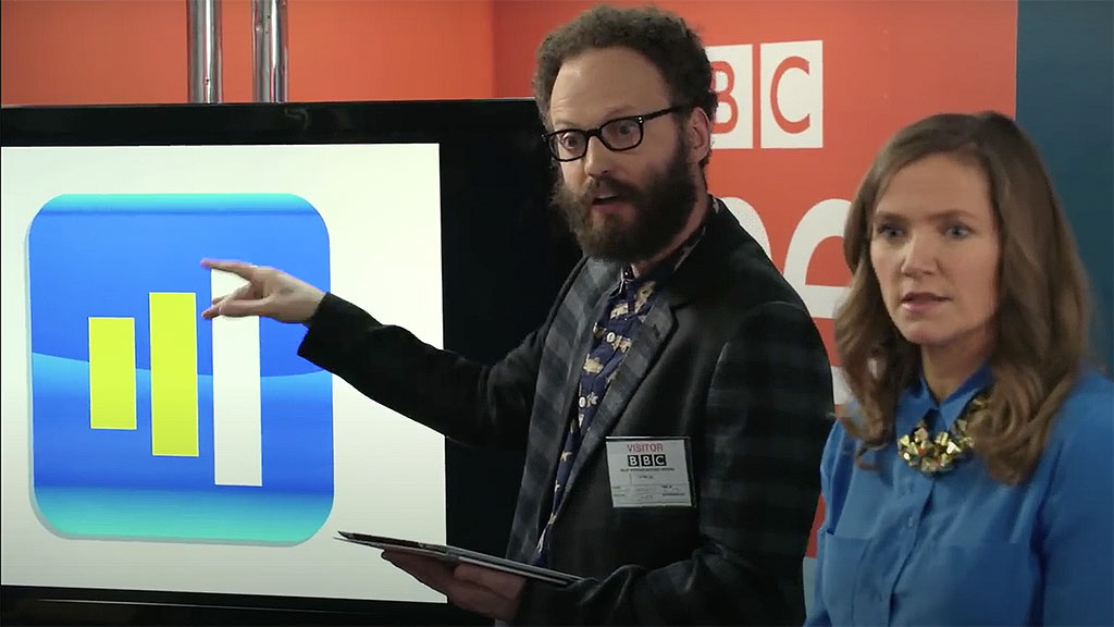
It all sounds strangely reminiscent of the third episode of the BBC self-parodic satire show W1A from 2014, in which Barney Lumsden, an “ideation architect” at fictional brand consultancy Perfect Curve presents a brave new look for the logo of the corporation, losing the letters BBC to make it feel more like an app.
