ITV, the UK commercial television channel, is beginning to engage with iTV, with two hit interactive shows on Saturday night, but attention to the user experience will be critical for long-term success.
Who Wants to be a Millionaire? is the perfect playalong programme for interactive television. Synchronisation is critical, as viewers have the option to respond to questions from the host at the same time as the studio contestant.
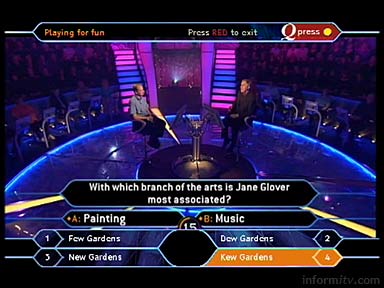
Unfortunately, on Saturday they apparently played out the wrong file, so the interactive on-screen prompts were not only out of sync, they also consistently presented answers to a completely different set of questions.

When it came to the walkaway question, at which the contestant bowed out, the interactive application asked “With which branch of the arts is Jane Glover most associated?” The British conductor is of course connected with the field of music, but according to the application, the correct answer was “Kew Gardens”.
The problem remained uncorrected for the first part of the programme, but according to the ITV call centre there were no complaints from viewers, which is perhaps more of a concern.
The operational aspects of delivering interactive services, particularly monitoring and quality control, should not be underestimated. Operators need to have the capability to identify and rectify potential problems at the earliest possible opportunity.
Hell’s Kitchen
Fortunately, the following programme, the reality show Hell’s Kitchen, marked a return to form. The application for the second series was once again developed by PushButton, and once loaded seems particularly responsive.
The ‘menu’ design is appropriately elegant, centred beneath a quarter screen image, subtly incorporating the branding of the programme sponsor. Viewers have the option to vote, enter competitions, catch up with the latest developments and read profiles of the contestants.

The branded competition area looks suitably sophisticated, reinforcing the brand values of the sponsor. Particularly pleasing are the design details that overlay the quarter screen video inlay.
Sadly, the menu is overloaded with other prize competition options, such as a ‘Spin to Win’ competition, that have little to do with the programme and detract from the interactive proposition.
In pursuing such incremental revenue opportunities, the commercial network risks missing the opportunity to build a deeper relationship with its audience and diluting the brand experience for the programme sponsor.
By offering a coherent user experience that extends viewer involvement with a programme, users are more likely to be encouraged to experiment with other interactive options. Conversely, providing a confusing experience is more likely to drive them away forever.
